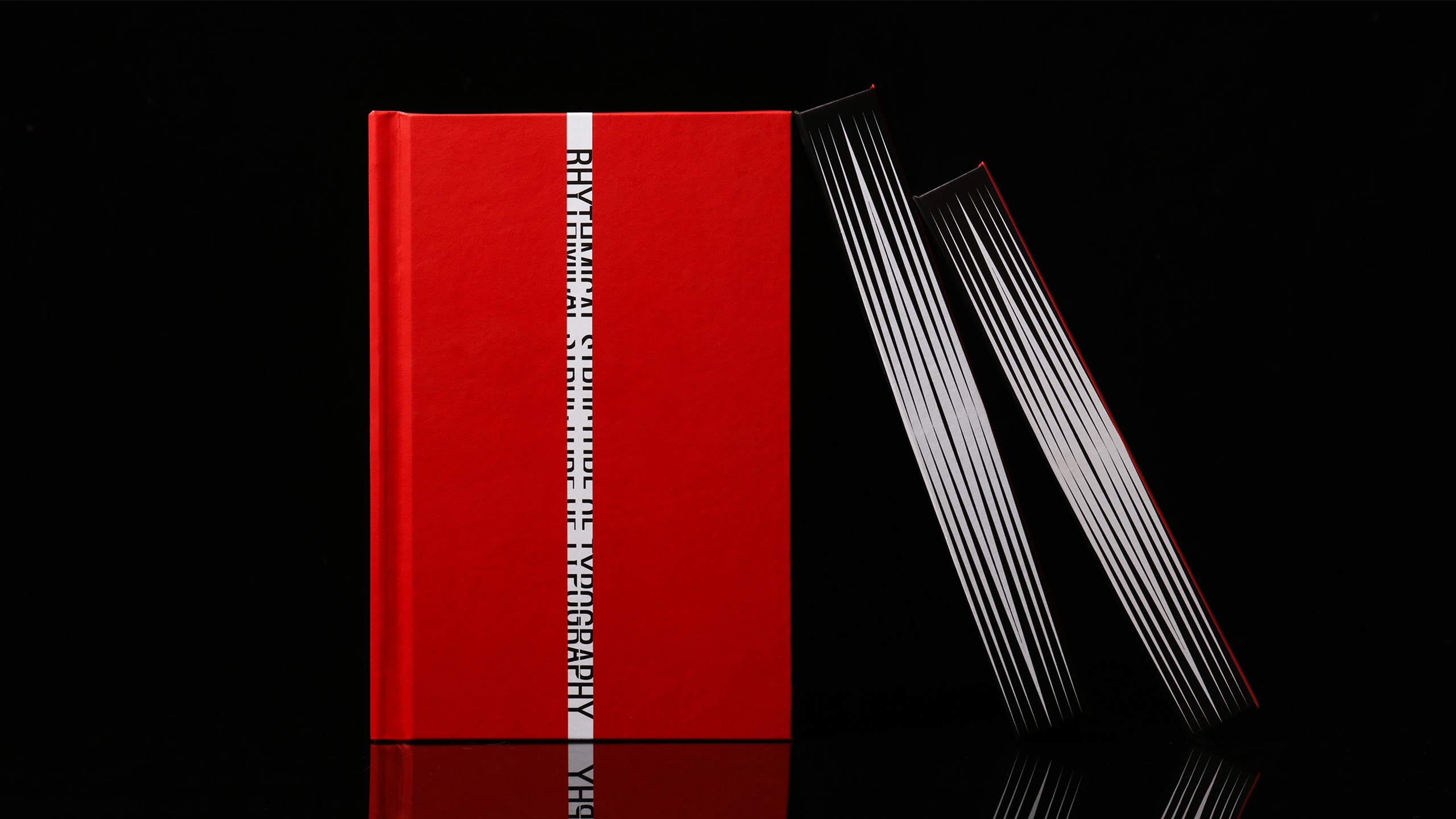
Typography is often described as the art of making language legible. Yet some of its most memorable experiments begin when letters do more than deliver information. In Rhythmic Structure of Typography, designer Yiwen Zhang treats type as a visual and emotional medium, drawing on the restless energy of punk culture.
The project examines themes of self-expression, rebellion, and the do-it-yourself spirit. Its graphic language is deliberately forceful, using visual rhythm to connect the printed page with the emotional intensity of music.
What makes the work interesting is the tension between structure and disruption. Typography depends on systems—grids, spacing, hierarchy, repetition—while punk aesthetics often challenge precisely those conventions. Zhang brings the two into conversation, allowing design to communicate not only through words but through the pace and pressure of their arrangement.
The designer also frames the project in relation to mental health and creative expression. It is important not to confuse that ambition with a demonstrated therapeutic outcome. The project is best understood as a design-led exploration of how visual culture might create space for people to articulate difficult experiences.
In an era of standardized digital interfaces, such experimentation feels particularly relevant. Much contemporary communication aims to be seamless, frictionless, and instantly understood. Zhang’s work proposes that resistance and ambiguity can have expressive value too.
A page can be orderly and still feel empty. It can also be challenging, imperfect, and alive. Rhythmic Structure of Typography belongs to the latter tradition, reminding us that graphic design can be an experience before it becomes an explanation.
International Design Awards 2023 — Graphic Design of the Year